Inside Menestrello — Part 3: Interesting features
RSS • Permalink • Created 28 Jun 2014 • Written by Alberto Pettarin
This is Part 3 of a “behind the scenes” tour of Menestrello app. In this post, I cover some interesting features of Menestrello. In Part 1 I gave the motivation that made us develop this app, while Part 2 described its high level architecture.
Power to the user
One of our design goals was to provide the user with the largest possible control over her reading+listening experience, especially considering that we pitch the reflow property as one of the key features of Audio-eBooks, being a clear advantage (over Fixed Layout) for long texts.
Hence, we tried our best to give the user the maximum number of options when configuring the app. Like other readers of reflowable books, Menestrello supports a number of “standard” settings:
- a dozen of different font faces (including three specific for dyslexic readers: OpenDyslexic, TestMe Sans, TestMe Serif),
- font size (with a wide range of sizes),
- line spacing,
- changing the margins (both left and right, or each independently), and
- changing the background color and the font color (independently).
(Yes, a missing feature is the text alignment, it is on our TODO list already :))
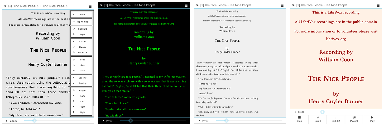
Additionally, we have the settings related to the synchronous highlighting of the text: besides the style chosen by the author of the ebook, there are several other styles (background colors, font colors, underlining, increasing the font size) for the active (highlighted) Media Overlay fragment. And, of course, the highlighting can be turned off, while still retaining the tap-to-play function and the auto-scroll of the text.
In fact, beyond these “typographic” settings, we have “behavioral” and “UI” settings. To list a few:
- toggling the tap-to-play function,
- toggling the auto-scroll of the text,
- changing the playback rate (from 0.5x to 2.0x, with finer steps around 1.0x),
- showing/hiding the bottom “navigation” bar with the large buttons,
- showing/hiding the bottom “quick” bar,
- showing/hiding the progress bar.
All these settings can be changed within the Reader View, by opening the side bar or touching the title bar.
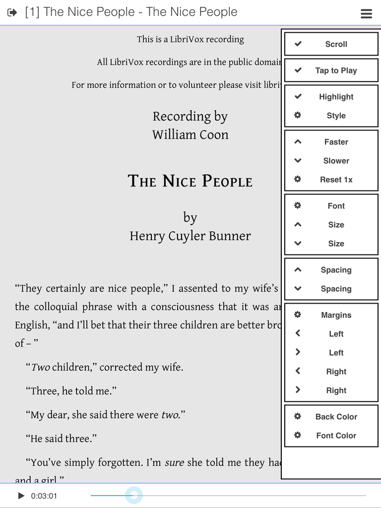
Moreover, we have an even bigger set of global options, affecting the behavior of the app, like:
- changing the UI language (DA, DE, EN, ES, FR, IT, PL, TR),
- changing the UI font (Roboto, OpenDyslexic, TestMe Sans),
- toggling a night mode/black UI theme,
- toggling swipe/margin tap to change chapter/scroll,
- deciding when/where to open an imported book,
- keeping playing audio when backgrounded, or pause it and resume rendition when the app is activated again,
- keeping playing audio when changing chapter,
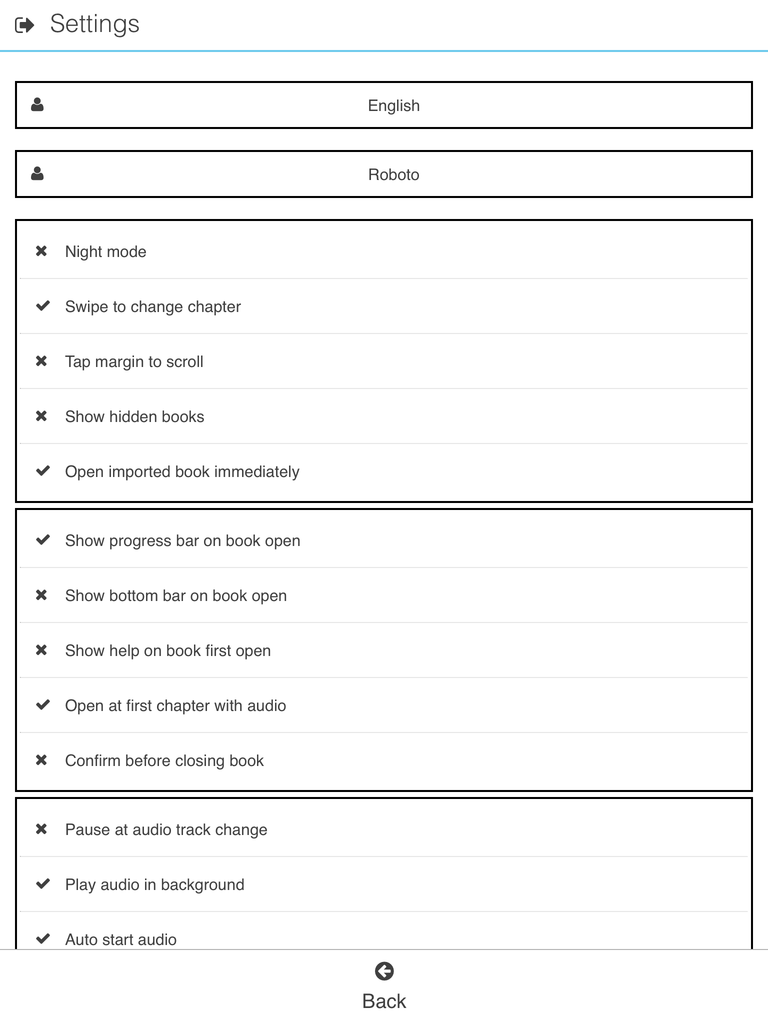
- opening an Audio-eBook at the first chapter with associated audio,
- enabling playing audio slower or faster,
- a set of settings related to footnotes (see below).
For a complete reference, please consult the online guide.
In Part 4 I will discuss in detail several improvements we plan to implement, but I want to mention two of them right now: saving the settings per-book (right now, the settings are saved globally, with the only exception of the bookmark/reading point), and better UI controls for the settings.
Footnotes
Another interesting feature of Menestrello is the
bottom panel where footnotes are opened.
The mechanism is similar to what other apps (e.g., iBooks) do:
if a link bears the epub:type="noteref" attribute,
Menestrello will open the target in a bottom panel,
conveniently mimicking the familiar “footnotes” of paper books.
In the next screenshot, you can see a linguistic annotation (in Italian) about the word chimes (ref. [55]):
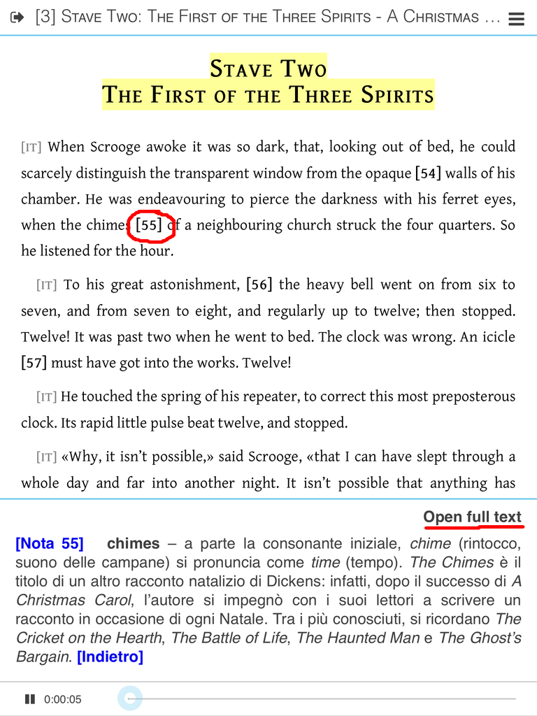
The user can disable this behavior, by toggling the corresponding global option in the app Settings; if disabled, the note reference will behave as a regular internal link, simply leading to the target in the main text area. To dismiss the bottom panel, just tap the footnote reference again or the panel itself. If the note is very long, the user can tap on the Open full text link in the panel to open the note full-screen.
Opening a bottom panel, instead of a popup, has a big advantage: it allows the reader to simultaneously see the text of the note and the passage of the main text where the note reference is placed. A few minor adjustments to this functions are needed (e.g., tapping on a footnote on the bottom part of the screen might result in the panel overlapping or covering the text), but I think this is a very nice example of the fact that some aspects of traditional paper typography might be kept in digital books as well, because they have a solid function.
Parallel texts
Parallel texts are quite popular in Italy, because people read Greek and Latin classics and some modern literature with a facing Italian translation. Unfortunately, right now there is no way to code an EPUB containing parallel texts in a declarative way, that is, via “semantic” markup, that will result in the expected “facing-pages” UX.
Common workarounds include using Fixed Layout or other “typographical” approaches like two-columns tables, interleaving or linking paragraphs. Another possible way leverages JS, but we all know it is supported by very few reading systems. Clearly all these approaches are non-semantic, and they have several usability problems.
The IDPF Advanced/Hybrid Layout Charter is discussing multiple OPF renditions inside a single EPUB 3 container (multiple OPF were essentially forbidden in EPUB 2), but it seems focused on magazines and mangas, so I doubt it will ever cover parallel texts.
Menestrello has an experimental capability to recognize parallel texts inside an EPUB container. If an EPUB is recognized to contain parallel texts, translations can be shown in the bottom panel, as if they were footnotes, as the following screenshot shows:
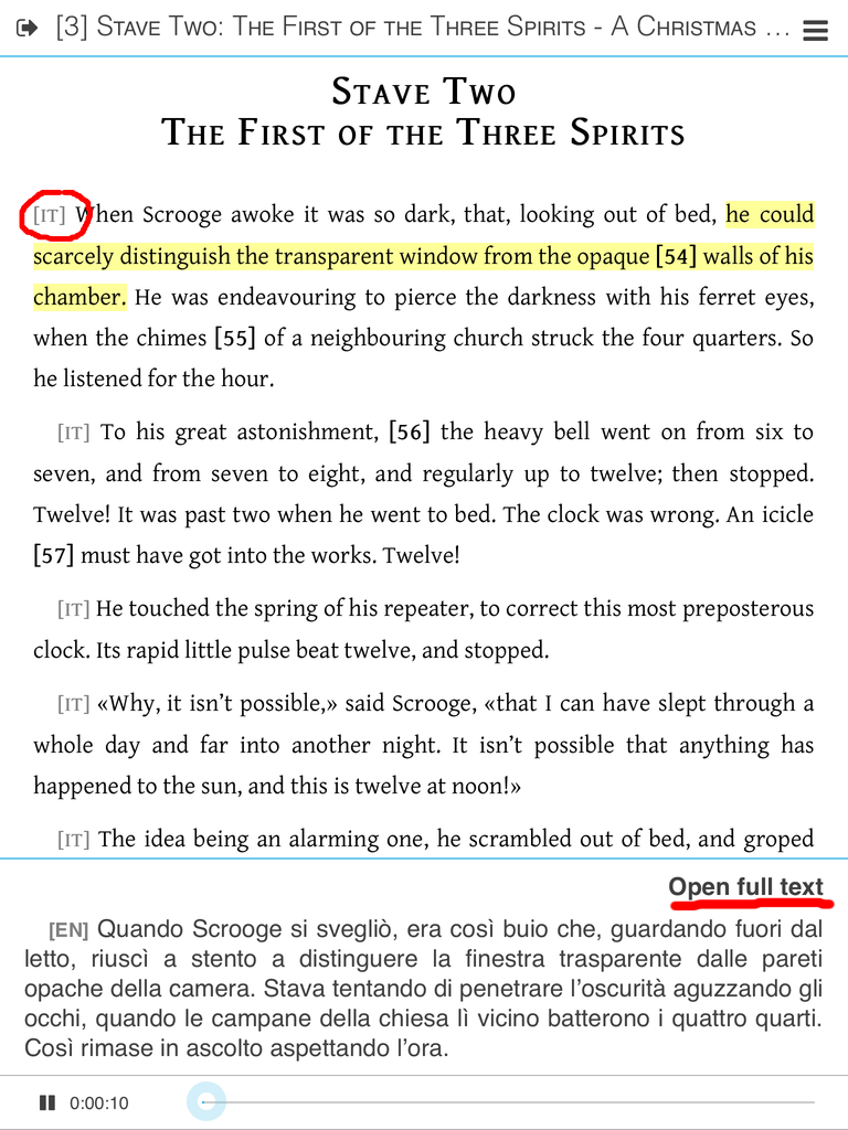
The above example shows the first paragraph of the English text, and the corresponding Italian translation in the bottom panel. The two paragraphs are on different XHTML files inside the EPUB, and a suitable markup allows Menestrello to match them. (Also note that this is an Audio-eBook!)
The current implementation is just a first step towards recreating the “facing-pages” UX, as we are not really displaying the two texts “in parallel”. But also note that not all users want “parallel” texts all the time: an expert or a person proficient in a foreign language just needs to glance sporadically at the translation. This observation allows me to remark the advantage of semantic markup over “typographical” solutions: it allows the user to customize her reading experience as needed. In principle, a reading system could split the viewport in two (or more!) areas, and display the parallel texts exactly as in the paper version, but it could also allow the reader to switch to a mode similar to what Menestrello currently does (“sporadic translations”).
I promise to write an extensive post on parallel texts in the near future. Meanwhile, you might want to check the EPUB3Reader project, which is a proof-of-concept Android app for parallel texts (in EPUB format), coded by three students of the University of Padova, under my supervision. The screenshots say it all.
Supporting <meta property="media:paused-class">
Besides the well-established <meta property="media:active-class">
that allows the author of an ebook to specify
the CSS class that the reading system should apply
to the current MO element when the audio is playing,
Menestrello reads <meta property="media:paused-class">,
which specifies the CSS class to be applied
to the current element
when the aural rendition is paused.
The idea is that the eBook author might want to provide visual feedback to the user about the MO status, differentiating the styling of the current element. I proposed the inclusion of this new meta in the EPUB specification.
Massaging the XHTML source
If you open an Audio-eBook from the English Short Stories collection
with a “regular” reading system, for example Readium, at the beginning of each chapter
you will see an <audio> element, with textual links leading
to the previous/next chapter and to the playlist:
This “navigation bar” embedded inside the XHTML code
of the eBook tries to cope with the limitations
of those reading systems which can play embedded audio but
are not capable of running Media Overlays or JS code:
it allows the user to listen to the embedded audio,
if without the synchronous highlighting.
(Note: for the same reason,
in iBooks the <audio> element is hidden
by the embedded JS code
that emulates the MO support in reflowable ebooks,
and which is included in our EPUB 3 Audio-eBooks.
For details, inspect the source of one of our Audio-eBooks.)
If you load the same EPUB into Menestrello, you will not see it:
In fact, Menestrello hides the “navigation bar”, resulting in a cleaner UX, since the MO and navigation management is done at app level. This “trick” is so specific to our Audio-eBooks that we have not provided an option to turn it on or off (yet).
In the next episode
In Part 4 I will discuss the weaknesses of Menestrello, how we plan to address them, and I will list some of the improvements we want to implement.