No user-provided CSS is a stupid CSS
RSS • Permalink • Created 18 Oct 2014 • Written by Alberto Pettarin
Several months ago I was talking to a friend, who has a rare sight disease. She told me that she finds reading red text over a lilac background easier.
This made me think.
No UI designer will ever allow such a “stupid” choice into a theme for an ebook reader app. Yet, there exists at least one person who not only does not think that that choice is stupid, but she even finds it useful!
This explains why our app Menestrello allows the user to select the font color and the background color independently one from the other, possibly creating bizarre combinations of settings, but also possibly fulfilling that one, unique user’s need. (Soon we will have a truly generic color picker, instead of the current limited palette. More freedom, yay!),
Some eBook designers/developers consider this freedom as a dangerous thing to be avoided like the black plague: “Are you seriously giving so much freedom to the user? Users are stupid! They will hurt themselves!”
Well, I care about my users and I do not think they are stupid.
I respect them and their needs, even when I dislike their choices.
I definitely think that, as the eBook designer or the app developer, I do not have any rights at all to impose my own typographic choices over the user’s preferences.
Because that is her reading experience, not mine.
It is about her freedom, not my education/taste/craft/erudition.
After all, this is one of the most appreciated advantages of eBooks over pBooks: ask those millions of people who are no longer forced to select what to read next using the (suitably large) font size as the first filter!
As an eBook designer, I must create a well-structured eBook for my reader, but also limit myself to suggest some reasonable stylesheet for it, but I should never impose my will.
(Before I can proceed, I must confess that I sinned multiple times on this point, before realizing my mistakes. Mea culpa.)
My role, as a developer of a reading app, is even more nuanced, because I must referee the conflicts between the choices of the eBook producer and the preferences of the end user. Conflicts between the CSS embedded in the eBook and the user’s preferences are common. Then, even the reading app itself might have settings that come at odds with the aforementioned two.
I think that the priority here is clear:
- the user rules;
- then the eBook designer can have a say;
- lastly, the app developer might speak.
Enough talk, let’s see some concrete example of this principle. I will use the latest version (v2.10) of ReadBeyond’s app Menestrello, because I code it, so I can tell exactly what is going on, and why.
How Menestrello renders EPUB eBooks
Menestrello is a hybrid app compiled with Apache Cordova. Roughly speaking, the app consists of a WebKit instance (the rendering engine at the core of Chrome and Safari browsers), displaying an HTML page located inside the app bundle, where the app logic is implemented in Javascript. (You can implement part of the logic in native code via native plugins, but this is irrelevant for this discussion.)
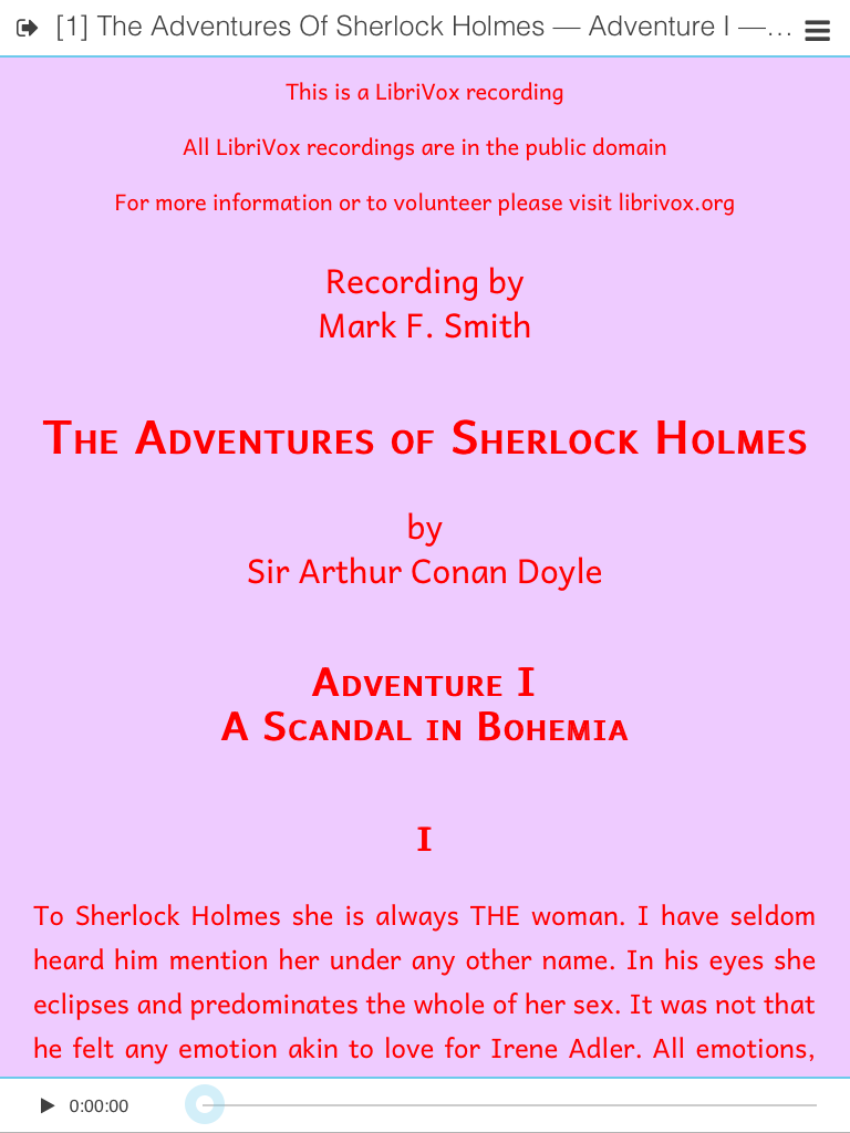
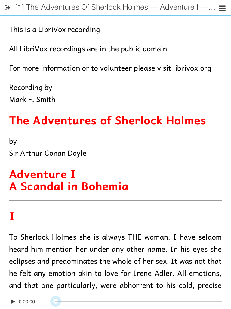
The reader view, which looks like this:
is actually created by an HTML source like this:
<html>
 <head>
  <!-- CSS, JS, meta here -->
 </head>
 <body>
  <div data-role="page">

   <!-- top menu bar code here -->

   <div id="divContentContainer" date-role="content">
    <!-- this is the main part of the view -->
    <div id="divContent">
     <div id="divContentInner">
      <!-- this is where the eBook contents are injected -->
     </div>
    </div>
   </div>

   <!-- footer code here -->

  </div>
 </body>
</html>
When an EPUB is displayed, the content of the current XHTML page is injected into divContentInner,
with href and src attributes suitably patched to match the app temporary directory in the device OS filesystem.
(We need three nested <div>s for technical reasons which are immaterial to this discussion.)
The typographic preferences selected by the user via the app controls
are applied to the divContent element.
Then, by app default, the regular CSS cascade takes place.
Since we inject eBook elements, including <link> and <style> elements
inside the divContentInner <div>,
usually the rendered page will look according to:
- the CSS rules defined inside the EPUB;
- where not conflicting with 1., the user-selected preferences.
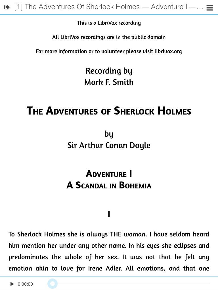
For example, on this EPUB, where the embedded CSS
does not contain any font-family rule,
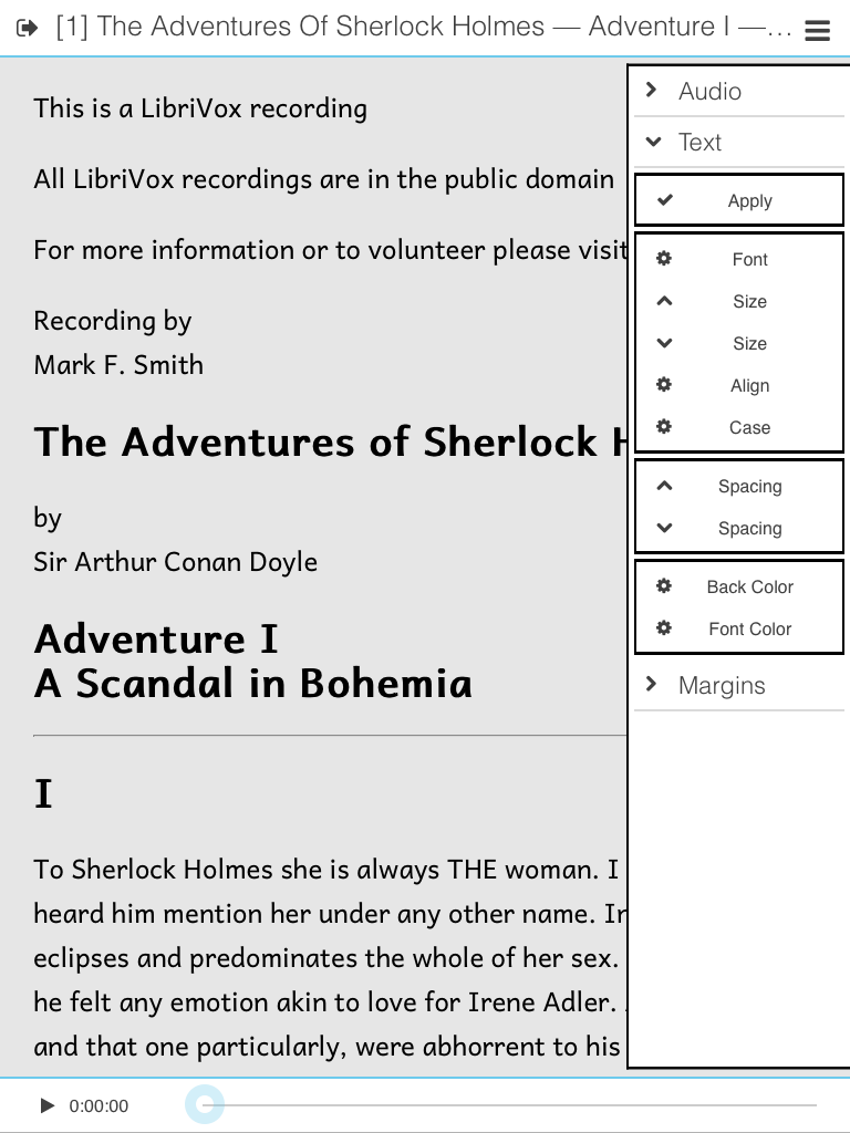
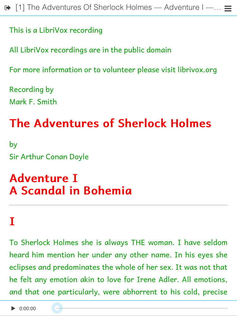
I can change the reading font from Andika to OpenDyslexic:
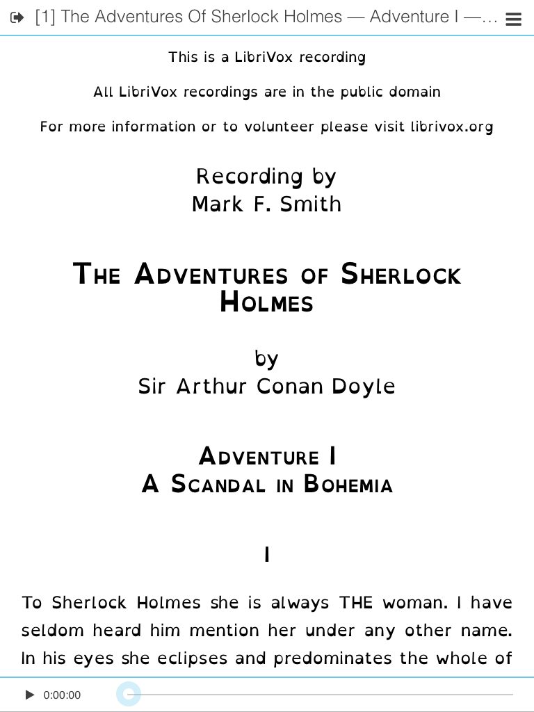
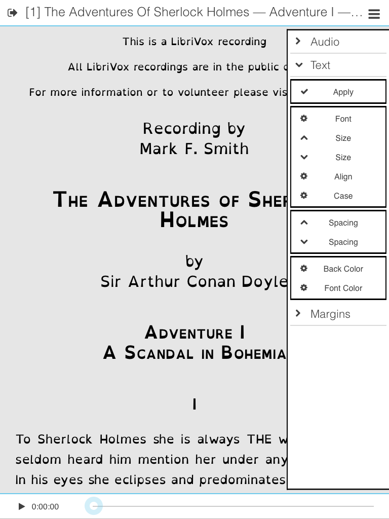
Note that the user can turn the injection of user-selected rules (step 2 above) off, by unchecking the “Apply” option in the right panel:
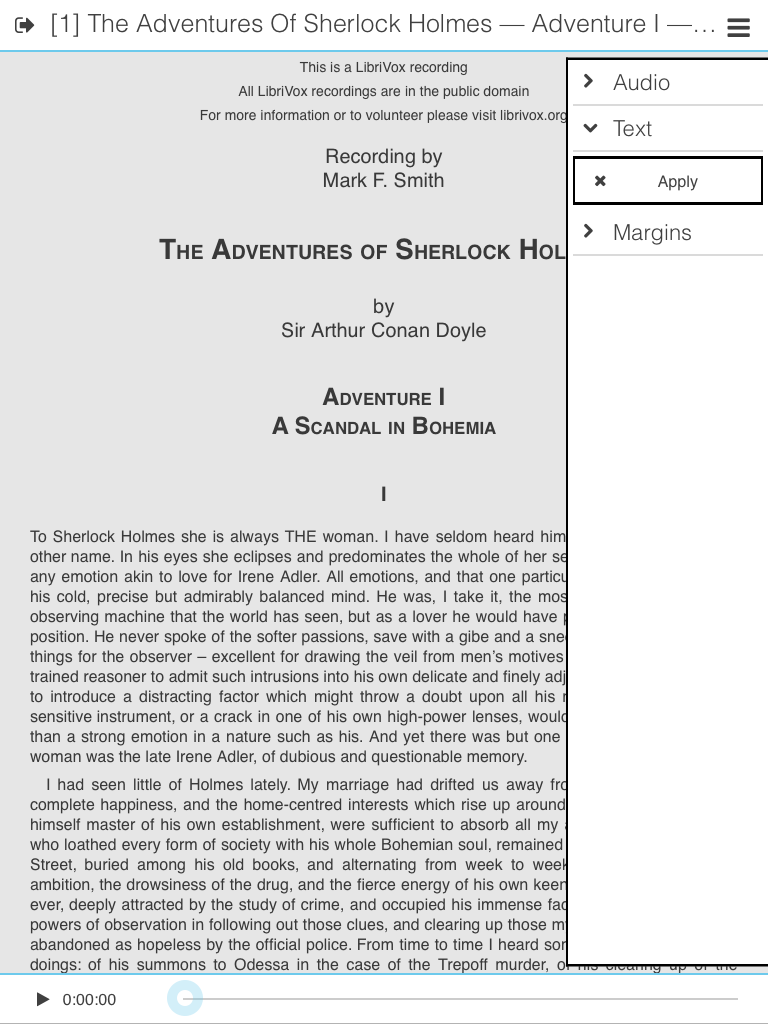
Note that the headings are still centered because the eBook CSS is still injected
and in effect, while the reading font defaulted to a generic sans-serif, with a generic size,
since the eBook CSS does not contain any font-family rule, and the app settings
specifying “to use OpenDyslexic font” has been disabled.
Unfortunately, relying on the CSS cascade is not guaranteed to work “as expected” on arbitrary combinations of arbitrary XHTML/CSS files. For example, if the book designer put in the eBook CSS:
p { color: black; }and the user selects “blue” as the font color in the app settings,
the text will still be displayed in black.
The reason is simple: the CSS rule (“black”)
is more specific than the one (“blue”) on the <div> container.
The situation is even worse if the eBook CSS uses class/identifier selectors.
(To overcome this limitations, time/resources permitting, I would like to implement a more refined approach in a later version of the app. However, I must say, even the basic mechanism works well enough on most eBooks I tested.)
Anyway, Menestrello has a couple of nice advanced features that the user might find useful.
Advanced option 1: ignoring publisher’s styles
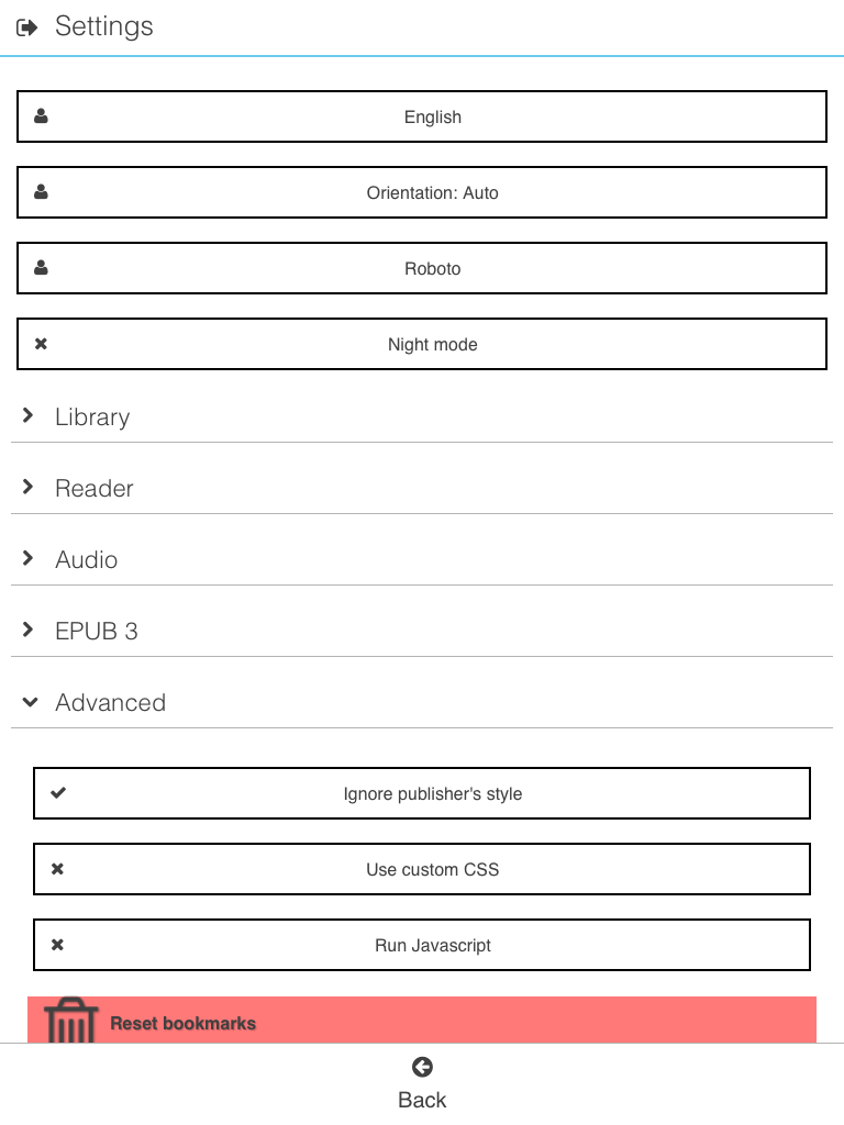
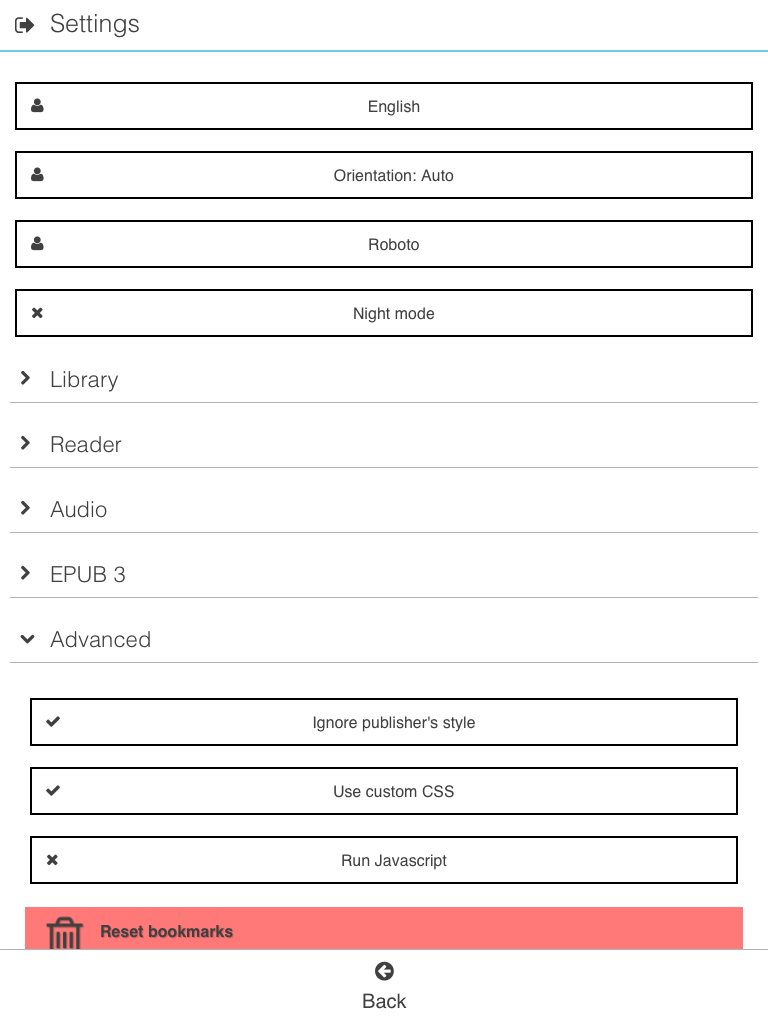
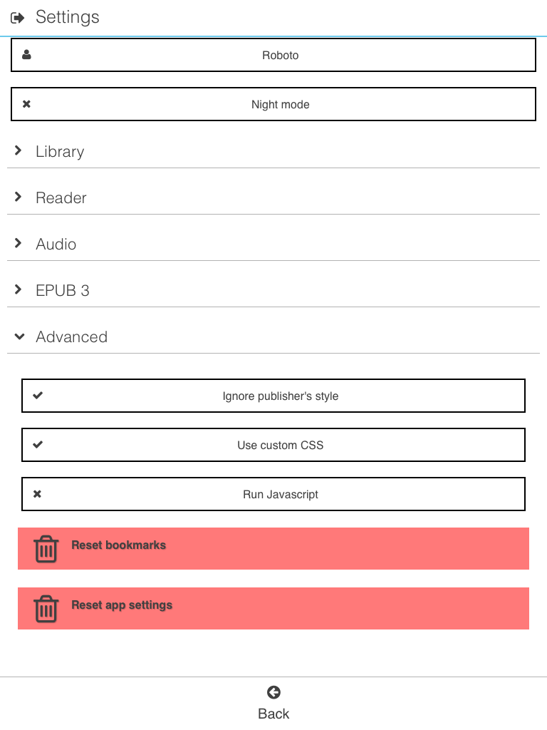
In the Advanced tab of the Menestrello Settings,
the user can command the app to ignore publisher’s styles.
When this function is enabled, the app will
strip any <link> element pointing to a CSS file,
and any inline <style> element,
before injecting into the WebView.
The consequence is that only the book settings, selected by the end user through the app UI, will be in control of the final rendering of the eBook contents. Continuing the above example:
The previous screenshot clearly shows that headers are no longer centered (as prescribed in the eBook CSS). However the reading font is still Andika, as set by the user through the app settings.
Advanced option 2: injecting a custom CSS file
Another interesting feature of Menestrello is the ability to inject a custom CSS file provided by the user. Again, you can enable it in the Advanced Settings:
Copy your custom CSS file, named custom.css, in the app directory.
On iOS, this is the app bundle directory accessible through iTunes.
On Android, it is /sdcard/menestrello/ or /sdcard0/menestrello/.
(If you use the night mode, your CSS file should be named custom.night.css.
This naming convention allows you to define two CSS rulesets,
one for the light UI theme and the other for the dark theme.)
Enabling this feature and ignoring the eBook CSS has the net effect of replacing the eBook CSS with your CSS.
If you enable this feature, but not the previous one, you will load both the eBook CSS and your custom one, with all the advantages/disadvantages of the CSS cascade.
For example, suppose that your custom.css contains:
h1, h2, h3 { color: red; }
p { text-align: justify; }
You will get:
Note that the headings are red, and the text of the first paragraph is justified indeed.
You can still set, for example, the color of the reading font to dark green through the app UI:
but, as you can see, the headings are still displayed red, due to the “more specific” rule
h1, h2, h3 { color: red; }dictated by the injected custom CSS file custom.css.
What if the user really screws up?
Menestrello offers two levels of “panic buttons”.
First of all, in the eBook info page, the user can reset all the reading settings associated with that specific eBook, without affecting, e.g., the current reading position or bookmarks:
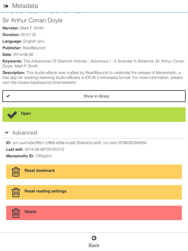
(Reading settings and bookmarks are saved separately for each eBook, hence you can set e.g. different font sizes for different eBooks.)
An even more drastic measure can be found in the Settings > Advanced tab. There, you can reset all the app settings to their defaults:
Final remarks
What do you think about these not-so-concise (my apologies!) thoughts?
Altering the CSS cascade is a really difficult task, but I really want to experiment a bit in this area.
One enhancement to our Menestrello app consists in letting the user
“build” her custom CSS directly inside the app,
using a visual/hold-and-move-blocks editor,
with an “export to filesystem” option.
Another one consists in extending the custom.css loading mechanism
to each eBook separately, and to support a “direct import” into the app,
especially for iOS.
(Now you need to use iTunes to copy your custom CSS file into the app.)
Finally, a really cool thing will be editing the eBook CSS on the fly, directly inside the app, and save it back into the EPUB file!